Many journalists enter the field to interview people, not data. But that doesn’t mean we can just do anything with our numbers. Here are three bad graphs by journalists, and how you can do better

Data is tough. Stats can be confusing, graphs unclear, and a journalism education typically doesn’t come with math classes. Meanwhile, it’s becoming harder and harder to tell stories without tangling with some numbers—especially since COVID-19, where it seemed like every piece spread the latest number of case counts or reproduction rates. Here are three instances in which journalists could have done better at telling the news through data—and some tips on how to do it well yourself.
Wisconsin: My favourite number
As you may remember from kindergarten, when you count, you start at the smallest number. You may also recall another grade school concept: bar graphs are composed of bars.
This graph manages to break both of these rules by making one the biggest number, and by fashioning its bar in the shape of Wisconsin.
Crimes against mathematics aside, this graph suggests that January through June 2020 was a big time for tornadoes in Wisconsin, which is false. The actual data shows that the state only had one tornado by June 4, 2020, compared to an annual average of 23.
While your eye was distracted by the massive Wisconsin-shaped “bar” to the left, it probably also missed the biggest problem. Have a look at the bars for 2016 and 2015. Their values are 16 and 17 tornadoes, respectively. But don’t their bars look a little…small? By that scale, 23 looks almost five times bigger than 16. But that can’t be right….
Oh God, the scaling!
Here’s how this should actually look: consistent scaling, and no maps where bars should be.
You are getting sleepy…(or just confused)
Doesn’t it feel like it’s looking at you? Drawing you into the centre, spiraling in, down into the maw…and away from any of the data it’s supposed to be presenting!
This wild guy appeared in a January 2022 New York Times opinion piece about when the Omicron variant of COVID-19 was expected to peak that month.
Of course, this has almost nothing to do with most of the data on the graph, which covers the entire history of COVID-19 from March 2020 onwards. The relevant part is that trumpet-head part at the very top, where cases rise in late 2021.
Did you look there first? Probably not, considering that spirals attract the eye to their centre. While we’re circling inward, let’s talk about this odd starburst axis: each of the radiating lines represents a month of the year (though only four are labeled).
Following the pink trail around them, we can see COVID-19 cases ebb and flow throughout the years, with spots of intestinal trouble indicating waves of infections. If you really squint, it's possible to make out that November 2020 saw a rise in cases, as did late summer 2021.
But you have to fight with the information, since looking for labels takes you to the edge of the graph—and away from the data you were looking at.
Credit: The New York Times.
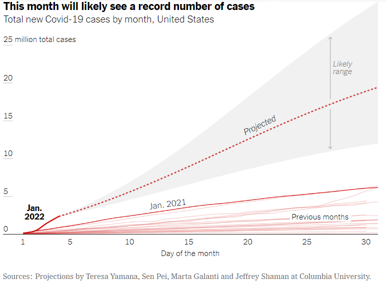
To their credit, the Times does include a far more conventional graph of the same data (this one was actually provided by the epidemiologist who wrote the article). Some detail is lost—only January of 2022 and 2021 are labeled, so the pandemic can’t be easily followed through the years. But the point is far more clear: COVID-19 cases were expected to go way up in January 2022.
Calculated Risks
In January 2023, CBC reported on alarming new findings: government-affiliated experts were now calling for cancer warning labels on alcohol, and were warning that anything more than two drinks per week could mean serious health risks.
The warnings came in Canada’s Guidance on Alcohol and Health which had been recently issued by The Canadian Centre of Substance Use and Addiction (CCSA).
CBC reported that “Three-to-six drinks a week increases the risk of developing certain cancers…and more than seven drinks a week also increases your risk of heart disease and stroke. The danger goes up with every additional drink.”
Clearly, it was important for Canadians to know the risks of drinking. Yet the story left out one sticky detail: how much, exactly, does a drink increase your risk of getting cancer?
Yes, CBC reported that the risk goes up, which is accurate. But what is the baseline risk, and how much does drinking exacerbate this? In an opinion piece for The Globe and Mail commenting on the new guidelines, medical historian Dan Malleck pointed out that the CCSA presented relative risks, rather than absolute risks.
That’s important: according to the CCSA’s data, writes Malleck, “consuming three and a half drinks a day increases your risk of developing larynx cancer by nearly 100 percent, which sounds shocking…but larynx cancer, which is mostly related to smoking, was diagnosed in roughly 0.0197 percent of Canadians in 2022.”
Doubling that risk still leaves you with a very small risk. And that’s the problem with relative statements: it’s possible to make a small number look important by multiplying it by a big number, even when the result is still a really small number.
Even still, CBC didn’t report any of this in its article. It simply said the risk increased.
For a story all about the importance of showing people the risks, you’d think they would have mentioned that.
About the author

Anthony Milton is a Master of Journalism student at Toronto Metropolitan University. Before entering journalism, he worked as a consultant in the electricity and climate space. He’s interested in longform writing and data journalism, about culture and politics. You can find his words in Toronto Life magazine, and his tweets at @C_AnthonyMilton.